
When creating the logo, Kyle designed various logos, some of which are original and other he got from inspiration of rap artists logos which he developed into his own style to fit the name R.ICO and give it its own unique touch.
The smaller logo above was inspired by Drake, as you can see the R is the same as Drake’s logo, however the rest Kyle had to improvise. I think it looks good because it’s simple but effective and if you put it in colour it would look good and change how it looks depending on the house colour. It however in my opinion looks slightly childish as it looks like bubbly writing so it sort of goes against rap conventions to some extent as rap is usually aggressive and sexual yet this doesn’t portray that. Compared to Drake’s you can see he has a little dollar bill sign and hearts in his logo that could portray he is highly affluent and sexualised due to the hearts. Due to him having more than one heart, it could show he is a player and can’t settle for only one heart which is a common convention in rap.


The third logo down, the inspiration came from a snowboard company which is also called Drake. The R is also taken from this logo and the rest Kyle also had to improvise but in the same style. I like how the letters are cut of like it’s been sliced and in my opinion makes it look urban which matches rap as it is usually set in estates or the hood or the artist has come from these locations. When creating it though with R.I.C.O he found it hard, especially for some letters like C and the O because you have to cut off the top but because it is curved at the top it was hard to determine whereabouts to cut it as it had to still be visible of what letter it was.
The logo with the O inside of the C came from a mixture of logos but the style mostly was inspired by especially this one due to the CO as the O’s gave Kyle the idea of a darts board which sort of influenced the O being in the C making a gibbous shape like a moon. I found this extremely effective as it sort of reminded me of a bullseye target or a cope which shows conventions of violence and could suggest the artists rap lyric are on point, hitting the target every time. I think the O being in the C makes the logo look unique which is what we want in order to show individuality.
With the other logos, they were mostly original by Kyle. One of them he did in jail bars in the R and the O which applies to conventions of prison themes or crime in rap that is seen typically in gangster rap more than others. The one beside it he did in a graffiti style as this style too is seen in rap a lot so it would be appropriate to see a logo in that style so I could be recognized easier and makes the artist look more urban and could portray his upbringing as stereotypically he would be classed as having a rough background.
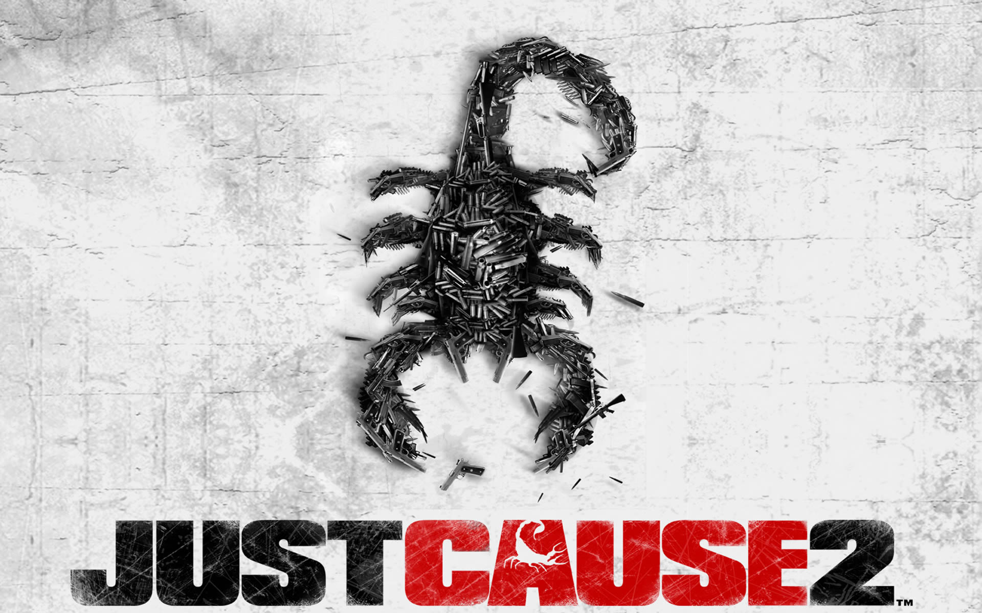
When first hearing the name R.I.C.O, Kyle instantly thought of the protagonist in a video game called Just Cause who had the same name which lead to him thinking of the scorpion due to its involvement with the game’s logo. It inspired him to do one of his own as many rappers are associated with animal such as their names, therefore the idea of a scorpion would be effective and the traits of a scorpion tends to be fiercely independent. They are able to accomplish anything they put their minds to and they won’t give up which is a good trait for our artist. This could present our artist as determined to be noticed and make good music and is highly competitive.
Through research of the symbolic connotations of a scorpion, Kyle found that they could symbolise sex, control, death, passion and protection which could link to the characteristics of a rap video/artist as they usually promote this therefore, because of this reason this would be a good symbol. The scorpion will mate in an exotic dance of passion and control. The scorpion sex dance is one of beauty, control and calculation which could apply to rap due to the lyrics being sexualised and they objectify woman or how it’s delivered is sexualised. They also symbolise strong headed in a way that whatever is in their path, they will sting. This representation fits in with a rappers identity as they tend to boast about their love for destroying anybody who gets in their way of succeeding and becoming rich.
In terms of semiotics, the scorpions signifier is a hostile animal, much like rappers these days. They threat, commit crimes and rebel, at least that's what they say. However the signified is actually a strong personality that is strong headed and prepared to do what needs to be done. Much like rappers doing anything for money, even breaking the law.
This comment has been removed by a blog administrator.
ReplyDelete